Open five stores in your category in five tabs. Odds are they share a theme lineage, a hero-then-logos-then-bestsellers rhythm, and the same three trust badges near the footer. Individually each looks fine. Side by side, they blur into one store with different logos pasted on.
That blur is a commercial problem, not just an aesthetic one. A shopper comparing tabs cannot form a preference between things that look identical, so they fall back to price. Distinctiveness is how you get chosen for a reason other than being cheapest. And it is almost always designed on purpose, not stumbled into.
01 · The problem
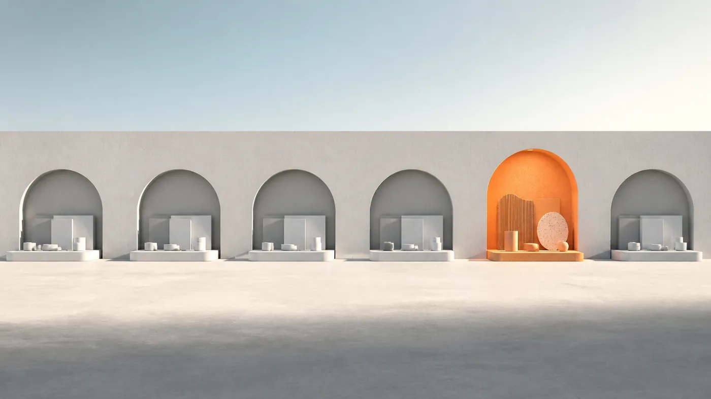
The category all bought the same template.
Templates are not the villain. They are a rational starting point—fast, tested, cheap. The villain is stopping there. When a brand ships the demo store with its own products dropped in, it inherits the demo store's personality, which is to say none. The result is a category where every site feels interchangeable and no site feels chosen.
The tell is easy to spot. If a customer could not describe your store to a friend without naming the product, the store has no distinctive memory. "The one with the huge diamond-inspection video." "The one that's all black with the red price tags." Those are distinctive. "A jewelry site" is not.
Sameness is comfortable to build and expensive to sell. Every shopper who cannot tell you apart decides on price.
02 · Location
Distinctiveness is not where you think.
Founders often reach for a wild hero animation when they want to stand out. Motion helps, but it is the most fragile place to differentiate—easy to copy, quick to date, and invisible the moment a shopper scrolls. Durable distinctiveness lives in less glamorous places.
It lives in the decisions competitors are too cautious to make:
- Structure — a homepage sequence that argues your promise instead of following the default demo order.
- Evidence — proof shown in a way the category avoids, like an inspection walkthrough or a live pricing readout.
- Language — a voice that sounds like a person with a point of view, not a settings panel.
- Restraint — one loud move in a quiet system, rather than five loud moves fighting each other.
These are harder to copy than a gradient because they come from strategy, not decoration. That is exactly why they last.
03 · Method
Build distinctive assets, then repeat them.
A distinctive brand is built from a small set of recognizable assets used relentlessly. Marketers call them distinctive brand assets: the color, shape, layout move, or ritual that identifies you even when the logo is out of frame. The power is not in inventing many—it is in choosing few and refusing to abandon them.
Pick one or two you will own completely. A single accent color used only for the decisive action. A photographic rule nobody else in the category follows. A signature layout for every product page. Then apply the asset everywhere: collection cards, email landings, the cart drawer, the 404 page. Consistency is what converts a nice detail into a brand memory. Our UX/UI line treats these assets as non-negotiables, coded into the section system so they appear automatically rather than depending on someone remembering.

04 · The line
Different is not the same as weird.
There is a failure mode on the other side. In the rush to escape sameness, some stores become distinctive and unusable—navigation you have to decode, animations that block the buy button, a layout so novel the shopper cannot find the price. That is not a point of view; it is a puzzle, and shoppers do not solve puzzles to give you money.
The rule we hold: be distinctive in the brand layer, conventional in the mechanics. People should instantly know how to shop—cart is top right, filters behave, add-to-cart is obvious—while the personality lives in tone, imagery, structure, and the one asset you own. Break patterns of taste, never patterns of usability. The best distinctive stores feel fresh and effortless at the same time, precisely because they only broke the rules that were safe to break.
05 · System
A repeatable distinctiveness kit.
Distinctiveness that depends on one hero page is a coincidence. Distinctiveness that survives across the whole store is a system. Before launch, we write the kit down as a short, enforceable set of rules so the personality holds up in every corner of the site and every future campaign.
A workable kit is tiny on purpose: a headline behavior, two or three color roles, an image treatment, a badge language, and a single motion principle. Small enough to remember, strict enough to defend against the slow drift of "just this once." When the kit is real, a brand-new page written months later still looks unmistakably yours, because the rules made the decision before anyone opened a design tool.
Quick check
Would a shopper remember you?
- A customer could describe your store without naming the product.
- You own one or two assets that identify you without the logo.
- That asset shows up on cards, email, cart, and edge pages.
- The shopping mechanics are still completely conventional.
- A page built next quarter would still look unmistakably yours.
Stand out where it counts.
Distinctiveness is not about being the loudest store in the category. It is about being the most specific—choosing a few assets and convictions competitors will not, and repeating them with discipline until they become memory. Do that, and you stop competing on price and start being chosen on purpose. The category will keep buying the same template. That is your opening.