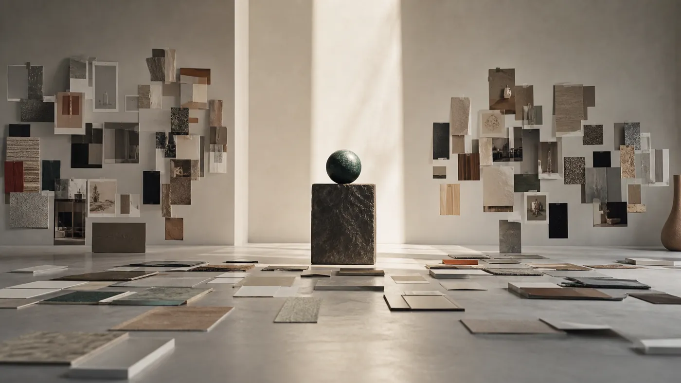
Almost every visual project starts the same way: a shared board fills with screenshots of other brands, textures, editorial spreads, and a few competitors nobody will admit to admiring. It feels like progress. It is really just a mirror of the room's collective taste.
A moodboard answers "what do we find beautiful?" A point of view answers "what will we do that our competitors will not?" Those are different questions, and only the second one produces a store that looks like itself. The gap between them is where forgettable brands live.
01 · The problem
Moodboards borrow. Points of view decide.
Reference is not the enemy. It is a fast way to align on vocabulary and rule out dead ends. The trouble starts when the board becomes the brief—when "make it feel like these" quietly replaces a real decision about who you are.
Borrowed taste has a signature. It is internally inconsistent because it is stitched from a dozen brands with a dozen different strategies. It ages badly, because trends move and imitation always arrives late. And it is impossible to extend: the moment you need a screen the board never covered, the whole thing falls apart because there was no principle underneath, only pictures.
You cannot art-direct a store from a mood. You can only art-direct it from a decision.
02 · The interrogation
Five questions that force a decision.
Before we translate anything into type, color, or motion, we make the direction survive five questions. Each one is designed to be answerable in a sentence, and each one closes off a lazy option.
- What is the one feeling a shopper should leave with? Pick a single word. "Trusted," "dangerous," "calm," "spoiled." If you name three, you have named none.
- What does everyone in this category do that we will refuse to do? A refusal is more defining than a preference. It draws the edge of the brand.
- If we could only keep one distinctive asset, what is it? A color, a shape, a photographic rule, a typographic move—the thing that would still identify you cropped to a corner.
- Who is this NOT for? A direction that offends no one attracts no one. Name the shopper you are happy to lose.
- What would make this feel expensive to the right person and cheap to the wrong one? Premium is relative and deliberate. Decide which signals you are sending.
03 · Translation
Turn answers into art direction.
The answers are not decoration; they are instructions. "Dangerous" and "calm" produce opposite type weights, motion curves, and image crops. A refusal to use stock lifestyle photography forces a real production decision and a budget line. The single distinctive asset becomes the non-negotiable that appears on every template, so the brand is recognizable when a shopper lands three clicks deep with no logo in view.
This is where our UX/UI line does its real work: not choosing pretty things, but converting five decisions into a small, repeatable kit—a signature type move, one accent color with a defined job, a rule for how product is shot, and a single way things move. Restraint is the point. Every element earns its place by expressing the point of view, not by looking nice in isolation.
04 · Discipline
Guardrails that keep it honest.
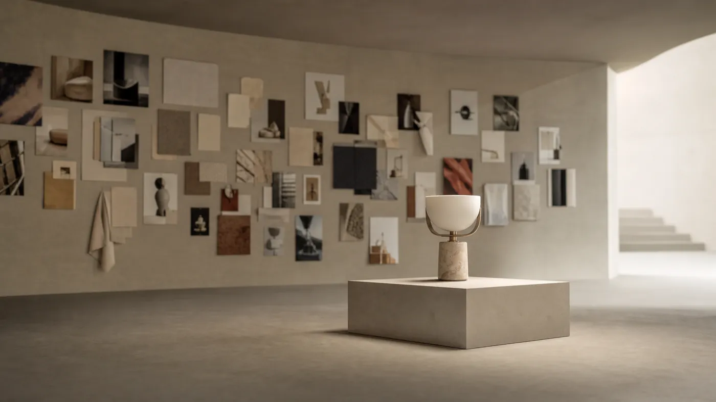
A strong direction is fragile in the wrong meeting. It dies by a thousand reasonable-sounding additions: one more badge, a slightly safer color, a competitor's clever module. Guardrails protect the decision from the drift.
We write the direction as a short list of dos and, more importantly, do-nots. "We never center our headlines." "We never use more than one accent color per screen." "We never show a model's face above the fold." These sound restrictive because they are—that is the value. A point of view is defined as much by what it forbids as by what it allows, and the forbidden list is what survives the pressure of feedback.
05 · The proof
The one-swatch test.
Here is the fastest way to know whether you built a point of view or a moodboard. Crop the store to a single element—one button, one heading, one product crop, no logo—and show it to someone who knows the category. If they can guess it is you, the direction is real. If they cannot, you assembled a mood.
The same test works internally. When a new page or campaign comes up, the direction should answer most of the questions before a designer opens a file. If every new screen restarts the debate, you never actually decided; you just collected images and hoped a style would emerge on its own. It rarely does.
Quick check
Direction, or just references?
- You can name the single feeling a shopper should leave with.
- There is at least one thing the whole category does that you refuse to.
- One distinctive asset appears on every template without the logo.
- You can name the shopper this is deliberately not for.
- A cropped, logo-free detail is still recognizably yours.
Keep the board. Just don't ship it.
Reference has a place at the start of a project—as a shared language, not a destination. The work is to move past it: to make five decisions sharp enough that a designer, a developer, and a growth marketer would all resolve the same tricky call the same way. That is a point of view. Everything after it, from the hero to the shipping copy, gets easier and braver because the hard choice already happened.