Give a merchandising team a theme with unlimited color pickers and free-text everything, and within a month the store has nine shades of "brand blue," four button styles, and headings in three sizes that were supposed to be one. Not from carelessness—from the absence of a system. Every choice was possible, so every choice got made.
A design system is how you keep a store looking intentional while still letting non-developers build pages. Shopify's OS 2.0 gives you the raw material—theme settings, sections, blocks, presets—but a system is what you construct on top of it. It is the set of decisions already made, so the team does not remake them badly.
01 · Contract
A design system is a contract.
At its core, a design system is an agreement between design and everyone who touches the store afterward: these are the colors, this is the type scale, this is the spacing rhythm, these are the components and how they behave. The value is not the pieces—it is the constraint. A good system makes the on-brand choice the easy one and the off-brand choice hard to reach.
Freedom in the editor is not a feature. Curated freedom is.
02 · Tokens
Tokens are the source of truth.
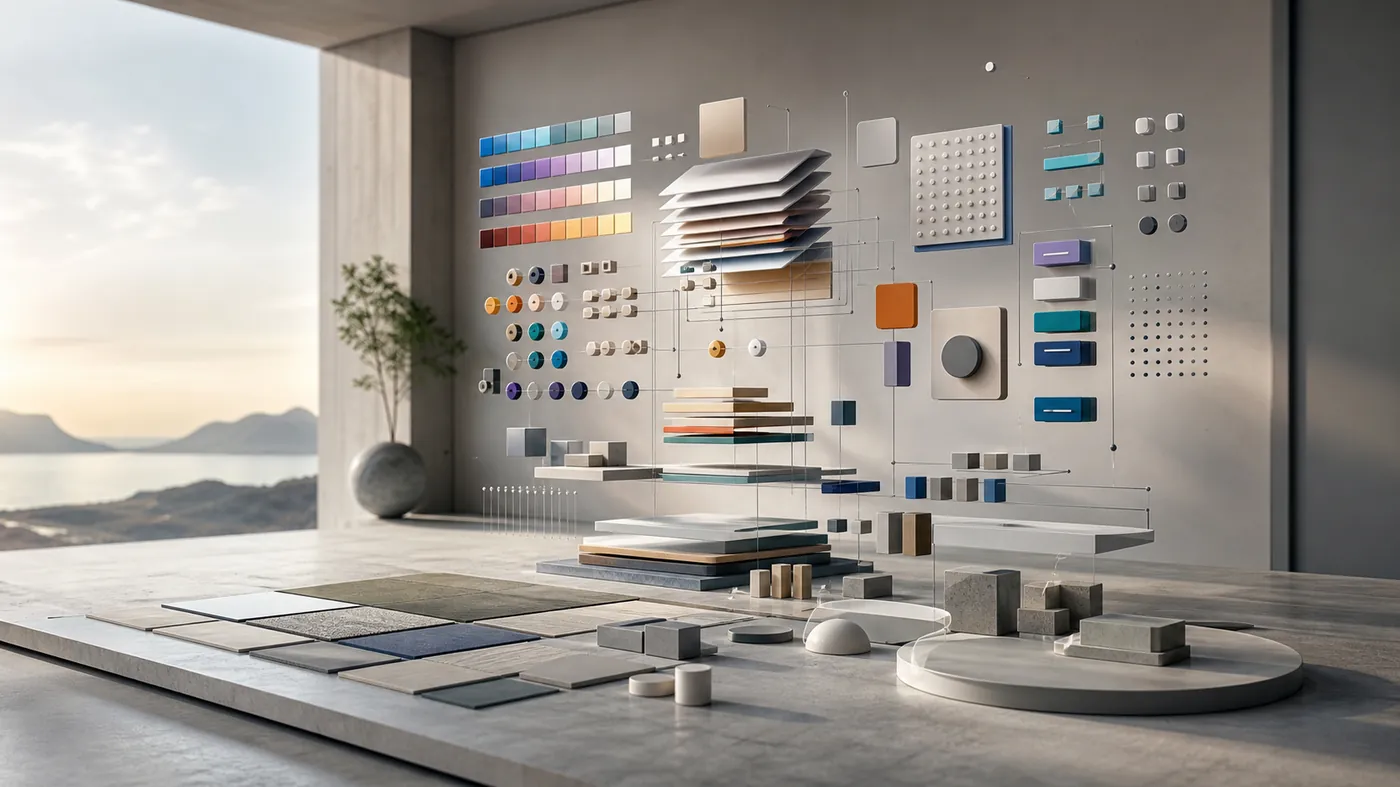
Everything visual should trace back to a small set of named values—design tokens—defined once and referenced everywhere. Colors become roles, not hex codes scattered through templates. Type becomes a scale, not arbitrary pixel sizes. Spacing becomes a rhythm, not whatever looked right that afternoon.
- Color roles: surface, text, accent, muted—so a rebrand is a token change, not a find-and-replace.
- A type scale: a fixed set of steps that every heading and body style maps to.
- A spacing scale: consistent gaps that give the whole store a shared rhythm.
Wire theme settings to these tokens and expose them through CSS custom properties. Then a section never hard-codes a color; it references the accent role, and one change updates the entire store coherently.
03 · Components
Sections and blocks as components.
In OS 2.0, a section is a component and its blocks are the component's variants and slots. A "feature row" section with image, heading and CTA blocks is a reusable pattern the team can compose without inventing new markup. The discipline is to build a considered library of these—each solving a real page need—rather than a sprawling pile of near-duplicates.
Keep the component boundaries clean: a component owns its spacing, its type mapping and its responsive behavior, so wherever it is placed it looks right. That is what turns "a bunch of sections" into a design system with genuine reuse.
Name components for what they do, not what they look like—a section called "feature row" survives a rebrand that a section called "big blue band" does not. And when a pattern proves itself on one page, promote it into the shared library instead of copying it into the next template. A component that lives in a single documented place is one the whole team reaches for rather than rebuilds, and that habit is exactly what separates a real system from a folder of sections that merely resemble each other.
04 · Presets
Presets encode good taste.
A blank section is an invitation to get it wrong. Presets are how a design system ships opinions: pre-configured versions of a section that already look right, so an editor starts from a strong default instead of an empty canvas. The "hero" preset arrives with the correct spacing, a sensible overlay and on-brand type—all the person has to do is swap the image and copy.
Good presets are the difference between a system people follow and one they route around. Make the right starting point one click away and consistency stops being a rule you enforce and becomes the path of least resistance.
05 · Guardrails
Guardrails keep it on-brand.
Every setting you expose is a decision you are delegating. Sometimes that is right; often it is not. A color picker on every text block guarantees drift. Instead, offer a curated set—accent, neutral, inverse—drawn from the tokens, and remove the ones nobody should use.
The same goes for content: sensible maximum lengths, image aspect ratios that match the system, limits on how many items a carousel shows. Guardrails are not about distrust; they are about protecting the brand from a thousand small, well-intentioned deviations.
06 · Longevity
The system survives the redesign.
The real payoff comes later. When the brand refreshes—new palette, new type, tighter spacing—a token-based system absorbs most of it centrally, and every page updates in step. Without one, a redesign means touching hundreds of hard-coded values and praying you found them all.
A design system is the part of the build that makes the next build cheaper.
Quick check
Do you have a system or just sections?
- Colors, type and spacing come from named tokens, not scattered values.
- Sections are a curated component library, not near-duplicates.
- Every section ships presets that already look on-brand.
- Settings expose curated choices, not unlimited freedom.
- A rebrand can be driven mostly from tokens, not template edits.
Consistency is a competitive edge.
Customers cannot articulate a design system, but they feel its absence as a vague cheapness—pages that do not quite match, buttons that behave differently, a brand that seems unsure of itself. Building the system into the theme is how a store stays unmistakably itself across every page, every campaign and every future edit. That coherence is not decoration. It is the brand.