Open your analytics and look at the split. For most Shopify stores, two out of three sessions — often more — happen on a phone. Then look at where the store was designed and tested: a large monitor, a fast office network, a mouse with pixel-perfect aim. The gap between those two facts is where mobile conversion goes to die.
A thumb-first audit closes that gap. It means judging every step of checkout the way the majority of your customers actually experience it: one hand, one thumb, a mid-range phone, a patchy connection, and about four seconds of patience. Here is how to run one.
01 · Reality check
Test on the device your customers use.
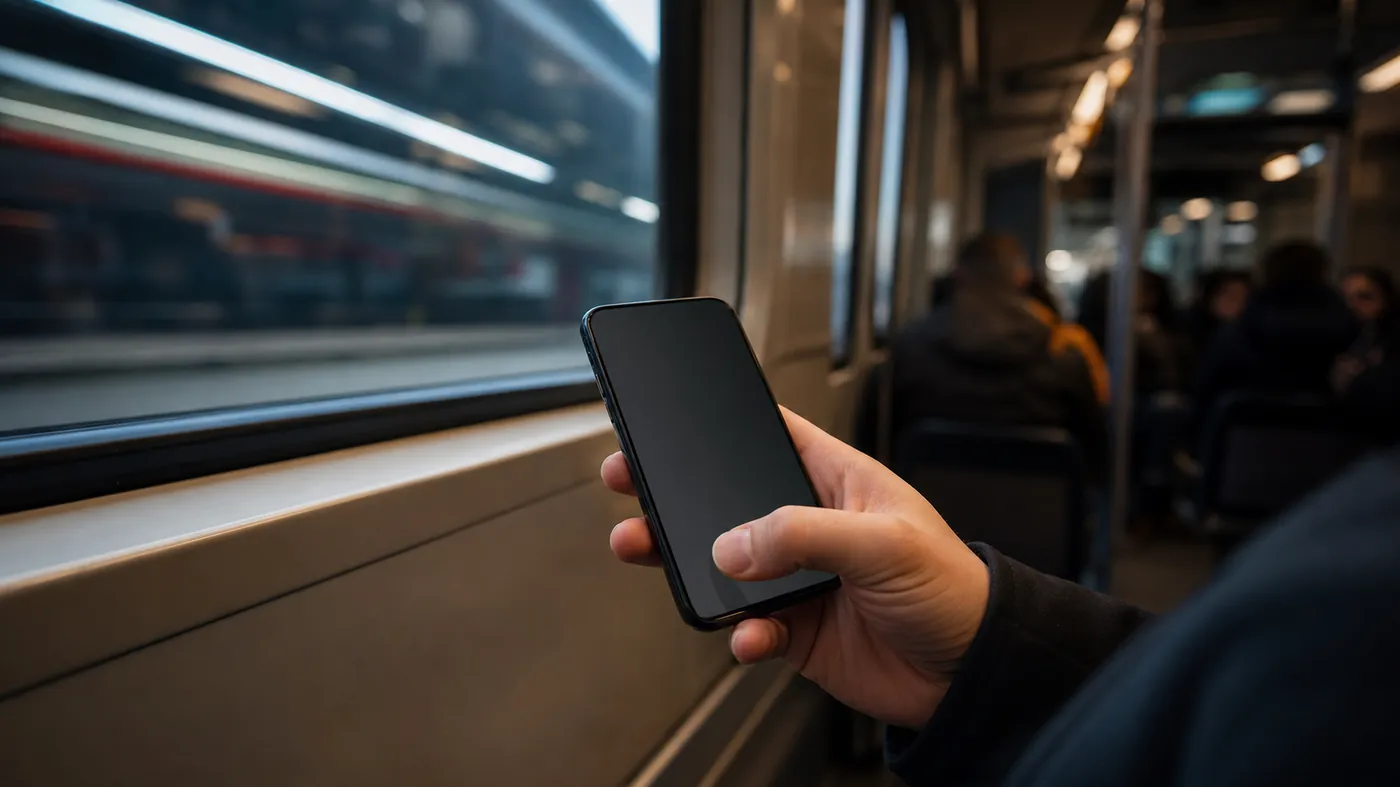
The single most useful change most teams can make is to stop auditing checkout in a desktop browser window shrunk to look like a phone. That view lies. It has a mouse, a fast machine, and no interruptions. Pick up a real, unremarkable phone — not the newest flagship on the team — throttle it to a normal mobile network, and try to buy something in one hand while standing up.
You will feel the friction your dashboards only hint at. Buttons that sit just out of reach. A keyboard that covers the field you are typing into. A discount box that steals attention right before payment. None of it shows up in a desktop QA pass.
If a member of the team cannot complete checkout one-handed in under a minute, neither can your customer.
02 · Ergonomics
The thumb reach zone.
Hold a phone naturally and your thumb sweeps a comfortable arc across the lower two-thirds of the screen. The top corners are a stretch; the very top is a two-handed reach. Primary actions belong where the thumb already is.
Audit every checkout step against that arc:
- Primary buttons — continue, pay now — anchored to the bottom of the viewport, full width, and large enough to hit without aiming.
- Nothing critical in the top corners, where one-handed users cannot reach without shuffling their grip.
- Sticky summary and pay bar so the next action is always under the thumb, not a scroll away.
- Generous tap targets with real spacing, so a slightly-off thumb still lands on the right control.
Shopify's own accelerated wallets exist partly because they collapse this entire dance into one thumb-friendly button. Surfacing them early is often the highest-leverage mobile change you can ship.
03 · Friction
Every field is a tax.
On a phone, typing is expensive. Each field is a small negotiation between the customer's patience and their desire for the product. Win by asking for less and making what you ask for effortless.
Set the right input type so the numeric keypad appears for numeric fields. Enable autofill and address lookup so a full shipping address costs one tap, not forty. Cut optional fields ruthlessly — every "company name" or "how did you hear about us" is a place to abandon. And never make a mis-typed field wipe the form; validate gently, in place, without punishing the customer for a fat-thumbed slip.
04 · Performance
Speed is a checkout feature.
A phone on a real network is slower and more fragile than the machine your store was built on. A checkout that feels instant in the office can stall for two seconds on a train — and two seconds at the payment step is where carts are lost. Mobile conversion and load time are the same conversation.
Strip the checkout and the pages that feed it down to what the sale needs. Third-party scripts, chat widgets, and tracking tags that pile onto the cart and checkout flow are a common, invisible drag. When we audit a slow mobile funnel, the culprit is usually accumulated app code no one is using — clearing that out is often worth more than any single design tweak. Fast is not a nice-to-have on mobile; it is part of whether the customer stays.
05 · Confidence
Trust on a small screen.
Doubt is heavier on a phone, where the customer can see less at once and feels further from recourse. The reassurance that a desktop layout can spread across a wide page has to be concentrated into the few inches the customer is looking at.
Keep the essentials in view at the decision point: the total with shipping already included, the return promise, secure-payment cues, and the wallet options that let a nervous buyer skip typing card details on a phone entirely. Removing uncertainty right where the thumb hovers over "pay" is the whole job of a mobile checkout.
Quick check
Run the one-thumb test.
- You tested on a mid-range phone and a throttled network, not a desktop window.
- Primary actions sit in the lower thumb-reach zone, full width.
- Fields use the right keyboard, autofill, and no optional dead weight.
- Accelerated wallets are surfaced early and prominently.
- Total, returns, and security cues are visible at the pay step.
Design for the hand that holds the phone.
The desktop is where checkout gets built. The phone is where it gets bought. Close that gap and mobile conversion stops being the number you apologise for in the monthly review — one thumb, one screen, one honest test at a time.