Quick answer
Premium is not a look you apply; it is a set of decisions a customer can feel. Crowded layouts read as anxious, so give each screen one focal point and room to breathe; vague copy reads as unsure, so put a concrete fact under every soft phrase.
Craft lives in the details nobody asked for — how a button responds, how an image loads, alignment that holds on an odd screen — and nothing undermines a premium claim faster than a page that hesitates. Restraint beats volume: ask of every element whether it makes the product feel more considered or just more crowded.
"Make it feel premium" is the most common request a studio hears, and the least specific. Founders picture a mood, hand over a moodboard, and hope the finished store carries the same weight. It usually does not, because premium is not a look you apply. It is a set of decisions a customer can feel.
The stores that command higher prices rarely share a visual style. What they share is a way of behaving. They waste none of your attention, tell you exactly what you are buying, and remove doubt before you have to ask. Get those behaviors right and even a modest palette reads as expensive.
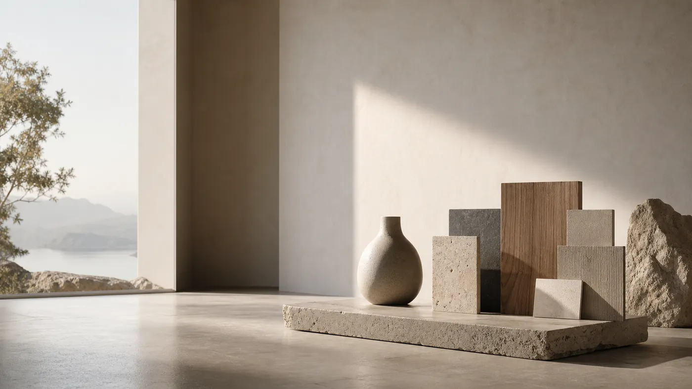
01 · Confusion
The look is not the feeling.
Copying the surface of a luxury brand — the dark theme, the tiny logo, the fashion-house serif — produces a store that looks the part and behaves like a discount site. The customer notices the gap immediately, even if they cannot name it.
Real premium is a contract. The brand signals, without saying it, "we have thought about everything, so you do not have to." That promise is kept or broken in dozens of small moments, none of which are font choices.
Cheapness rarely comes from the price tag. It comes from the sense that no one was paying attention.
02 · Space
Space is a signal.
Crowded layouts read as anxious. When a page crams every product, badge, and banner into the fold, it tells the customer the brand is worried you might leave. Confidence looks like room to breathe.
- One clear focal point per screen, not five competing for the eye.
- Generous margins that let the product hold the frame.
- Fewer, larger images instead of dense grids of small ones.
- Whitespace treated as content, not as wasted real estate.
Space is expensive to give away, which is precisely why it signals value. A page that is not fighting for your attention has already assumed it has it.
03 · Specificity
Specificity reads as confidence.
Vague copy is the tell of a brand that is not sure of itself. "High quality materials" says nothing. "Full-grain Italian leather that softens over two or three years" says the maker knows exactly what they made and expects you to keep it.
The same holds for the whole store. Specific shipping windows, specific care instructions, specific reasons this product exists — each one quietly raises the perceived value, because specificity is something only a confident brand can afford to offer.
Vagueness, by contrast, is a hedge. A brand writes "premium materials" precisely because it does not want to commit to a claim it might have to defend. Customers feel that reluctance even when they cannot articulate it, and reluctance is the opposite of the certainty a high price is supposed to buy. The exercise is simple: take every soft phrase on the page and ask what concrete fact sits underneath it. If nothing does, the price is resting on air.
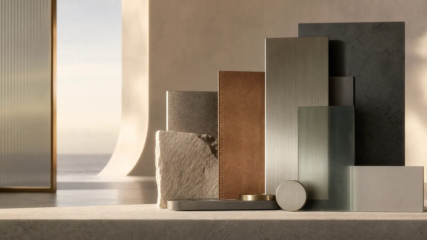
04 · Craft
Craft lives in the details nobody asked for.
The moments that make a store feel considered are the ones a customer never explicitly requested: the way a button responds to a press, the smoothness of an image loading, the alignment that holds on an odd screen size, the microcopy that anticipates a worry.
None of these move a single metric on their own. Together they create the impression of a company that finishes things. That impression is what a higher price rests on. When we build across our UX/UI and Development lines, this is where a disproportionate share of the effort goes — not because it shows off, but because its absence is felt.
05 · Speed
Speed is a luxury cue.
Nothing undermines a premium claim faster than a page that hesitates. A slow load, a janky scroll, a layout that jumps as images arrive — each one contradicts the story the design is trying to tell. Luxury is, in part, the absence of friction.
- The first meaningful view arrives fast, on a real phone and a real network.
- Image space is reserved so nothing shifts under the thumb.
- Heavy interaction loads when it becomes relevant, not all at once.
A brand that responds instantly feels in control. A brand that stutters feels improvised, no matter how elegant the type.
06 · Restraint
Restraint over volume.
The instinct under pressure is to add — another badge, another popup, another urgency banner. Every addition borrows against the feeling of calm that premium depends on. The harder, more valuable discipline is subtraction.
Ask of every element: does this make the product feel more considered, or just more crowded?
Discounts, countdowns, and hard-sell tactics are not forbidden, but they are expensive to the perception of value. Use them deliberately, and know what they cost.
Quick check
Does your store earn its price?
- Each screen has one clear focal point with room to breathe.
- Every soft phrase on the page has a concrete fact beneath it.
- Details hold up under a close, deliberate look.
- The store responds instantly on an ordinary phone.
- Nothing on the page reads as anxious or crowded.
Premium is a behavior, not a skin.
You cannot buy the feeling with a theme. You earn it by removing doubt, respecting attention, and finishing the details other stores skip. Do that consistently and the price stops being a question the customer argues with — it becomes the obvious cost of something clearly made with care.
Questions
Questions people ask.
Does a dark theme and a serif font make a store feel luxury?
No. Copying the surface of a luxury brand produces a store that looks the part and behaves like a discount site, and customers notice the gap immediately even if they cannot name it. Cheapness comes from the sense that no one was paying attention.
What actually signals premium on a Shopify store?
Space treated as content, specificity instead of “high quality materials”, details that hold up under a close look, and a store that responds instantly on an ordinary phone.
Why does speed matter so much for a luxury store?
Because a slow load, a janky scroll or a layout that jumps contradicts the story the design is telling. Premium depends on calm, and hesitation is the opposite of calm.